Quantcast
Channel: Latest blog entries - Embarcadero Community
Viewing all 1683 articles
Browse latest View live

Make Your Apps Scalable and Web-Enabled

$
0
0

This blog post accompanies the webinar Make Your Apps Scalable and Web-Enabled - Leverage your Business Logic with a Fast Flexible Multi-Tier Architecture - Using RAD Server and REST Services.

Create high performance, scalable applications by adopting a multi-tier architecture. By separating the UI/presentation layer, the server and the data layer, your apps will scale more easily with changing business needs and accommodate larger numbers of users. Multi-tier architecture also allows dev team members to focus on their strengths and add new services through a loosely coupled architecture which keeps the impact of changes small. This webinar demonstrates how easy it is to create a services-based app using REST/JSON, database integration, and RAD Server. We will look at the use case of the RAD Server Field Services Application Template and also provide examples of web-enabling your application with an Ext JS front-end.

Agenda

  1. The Monolithic Problem
  2. Architecture Types
  3. Why Does Scalability Matter?
  4. Microservices vs. Monolithic Services
  5. Making Your Business Logic Scalable
  6. Field Services RAD Server Template
  7. Using Ext JS for Web-Enablement
  8. Different Editions of RAD Studio

 Come back after the webinar for slides and resources!

[GoogleDocsButton url=https://docs.google.com/presentation/d/1CFJYqrlhMYgKdCpiYH2lMP1XL11RhiVFCNhjtYhK-6Q/edit?usp=sharing]


Read More

Prototyping: from Vision to UX Design

$
0
0
You have a great idea for an app, but how do you successfully get from idea to a well designed, functional app your users love? It starts with design wireframing and prototyping, a faster iterative process that requires less coding effort up front so you know what works and what needs to be improved - before you invest your hours and dollars coding. Application prototyping is an important part of application development. Since the initial release of iOS back in 2007, many mobile application focused prototyping tools have been released, designed to make it easier to illustrate everyone’s ideas, and successfully go from wireframing, to prototyping and production.
The process:
 

Wireframing

Pen and paper is still a popular method for wireframing, as it is by far the quickest way for anyone to visualize their ideas. You can easily draw a simple shape of your target form factor, and then draw some primitive UI shapes to highlight the key application functionality and flow between the various screens. 
A couple of years ago, I attended a tradeshow where one of the vendors provided a collection of printed sketch sheets and even a stainless steel UI stencil set for quick paper based wireframing. You can find a number of different stainless steel “UI Stencils” for sale online. A quick Google search for “printable sketch sheets for mobile application” will also yield a number of ready-to-print PDFs that help with paper based wireframing. The difficulty with paper-based wireframing is that it doesn’t lend itself well to an iterative process.
Digital tools facilitate faster iterations and some of them provide teams with the ability to collaborate and make changes in real time. There are a number of companies that specialize in digital wireframing. The applications range from desktop to mobile applications, designed to help product managers, UX designers, and developers collaborate on their next software project. A very popular application is Balsamiq. According to their website, ”Balsamiq is a rapid wireframing tool that helps you work faster & smarter. It reproduces the experience of sketching on a whiteboard, but using a computer.” To make digital wireframing easier for RAD Studio developers and their UX and product teams, we’ve created FMX Stencils, including FMX symbols and icons for use with Balsamiq to quickly create low fidelity wireframes. Designers can create wireframes and mockups in Balsamiq, Sketch, Photoshop, Illustrator or other similar tools using FMX Stencils. Once mockups are finalized, designers can share redlines of designs, style guides and assets with application developers for implementation using the matching FireMonkey UI controls and FireMonkey style in Delphi, C++Builder, and RAD Studio. Designers can also upload mockups to InVision and similar tools to create prototypes that illustrate component interactions.
 
Shown: FireMonkey symbols and icons for use in Balsamiq
 
Shown: FMX Stencils for digital wireframing and UI mockups in Illustrator.
 
The FMX Stencils pack includes:
  • Balsamiq, Sketch, Illustrator, Photoshop, SVG and PNG FMX stencils for a platform agnostic, generic user interface theme
  • Balsamiq, Sketch, Illustrator, Photoshop, SVG and PNG FMX stencils for the iOS Copper Dark Theme, part of the FireMonkey Premium Style Bundle
 

Prototyping

After wireframing your application screens, the next step is prototyping. Some of the wireframing tools on the market include some basic prototyping capabilities, such as being able to set up clickable areas, and define a flow between the various screens. This allows you to bring your creation to life and gives everyone a first impression of how the app is going to function. A designer can easily generate high fidelity wireframes using the FMX Stencils and their design tool of choice such as Sketch or Photoshop, and then pass those designs to a Delphi or C++Builder developer for implementation using the matching UI controls and theme in the FireMonkey framework.


Shown: FireMonkey GUI template using the Android Copper Theme in the IDE at design time


Prototyping with RAD Studio

Our development tools make prototyping a breeze by allowing you to see how your data fits within your UI design early on, with live data support from multiple sources including databases and REST APIs.
LiveBindings in RAD Studio allows you to rapidly build and deploy database applications by connecting fields and controls together in the IDE. If data is available from a data source at design time, then LiveBindings will display the data at design time exactly how it will show up at runtime. The ability to view live data at design time can drastically reduce the amount of time needed to polish the look and feel of an app.
 
Shown: BaaS enabled mobile application with live data at design time 
 
You can also benefit from early design feedback across a range of devices using our live preview functionality. FireUI Live Preview lets you view your FireMonkey application on your iOS, Android, Windows and Mac devices as you are designing the application in the Form Designer. Changes made in the Form Designer are broadcast to connected devices in real time.  This allows you to simplify the design process, prototype faster, and reach additional platforms quicker. 
 
  
Shown: FireUI Live Preview in action 
 
Another great option is our FMX GUI Templates. Compared to our FMX Stencils which are a collection of visual assets for designers, the FMX GUI templates are ready-to-use Delphi and C++Builder application templates. Delphi, C++Builder, and RAD Studio include 18 FireMonkey UI templates, designed to highlight FMX's multi-device capabilities, showcase best practices, and help new users get started quicker. They showcase UI design patterns that mobile application developers need in today’s applications.
They use the UI controls that ship with the FireMonkey framework, are optimized for a number of form factors, and some of them use our custom iOS Copper FireMonkey style that matches what we provide in our FMX Stencils pack. 
Delphi and C++Builder make it easy to go from prototype to production. You can easily set up events to use a collection of the UI templates in your multi-device application. Add sensors and services into your application, such as location support, Bluetooth LE and more, connect to a server backend and publish your apps within your enterprise or on the various app stores.  
If you’re new to our developer tools, I would recommend having a look at the Guided Tour. The Guided Tour is a step-by-step bubble pop-up tour that introduces you to the Form Designer and shows you how to build your first multi-device application using the FireMonkey framework. You can access the Guided Tour from the Welcome Page. Once you’ve finished the Guided Tour in the IDE, head over to Embarcadero.com and navigate to the FMX Stencils from the Free Tools section on the website.  
In this article, we covered how to get started creating wireframes using pen and paper or digital tools like Balsamiq, generate high fidelity wireframes using the FMX Stencils, followed by prototyping in the IDE and then easily go from prototyping to production with Delphi and C++Builder. Do you have a vision for a cool application? Check out our resources below and get started today.


UX Resources:


Read More

Aqua Data Studio(ADS)のご紹介

$
0
0

先日、次期RAD Studio Architect版について、アップデートの発表がありました。

その中で非常に興味深いツールが2つ追加されます。

一つめは、データベース管理/開発ツールであるAqua Data Studio。二つめはテスト自動化ツールのRanorex Test Automationです。

今回は、そのうちのAqua Data Studio(以後、ADS)をご紹介します。

ADSは非常に強力なデータベース開発、管理ツールです。


ADSがどのようなものか、ご紹介しましょう。まず、データベースサーバーの登録を行います。


ご覧いただけるように、様々なデータベースを使うことが出来ます。OracleやMSSQLといったエンタープライズ系から、Apache DerbyやSQLiteのような組み込み向け、そして、みんな大好き(?)なExcelもあります。

 データベース開発、管理ツールとしては、一通りの機能を備えています。

 ビジュアルなクエリの作成。


データベースをリバースエンジニアリングしてのER図の作成。


 実行計画もビジュアルに表示します。


これらの機能は大抵のデータベースツールが備えている機能ですが、非常にユニークなのは、FluidShellです。

これは、UnixのシェルとSQLのコマンドラインツールが「合体」したツールです。例えば、クエリ結果をExcelで欲しいというケースはよくあると思います。その場合は、以下のコマンドをFluidShellで入力します。

C:\Users\schikugi$:1> select * from embt.M_ORGANISATION
C:\Users\schikugi$:2> sqlexport -f excel2007 -o M_ORGANISATION.xlsx

SELECT文の結果バッファに保存し、それを標準出力と見なしてsqlexportコマンドでexcel形式に変換します。


逆に、標準入力をCSV形式と見なし、そこからテーブルにデータをインポートをするいうことも出来ます。


これらのデータベースのインポート、エクスポートはデータベースことにまちまちなのですが、FluidShellはデータベースの接続先定義を変えるだけで、違うデータベースでも同じように振る舞います。


Aqua Data Studioには、他にも様々な機能があります。データベースの管理と開発の両方を備えたツールは色々ありますが、大抵は、SQL DeveloperやSSMSのような特定のデータベース専用のツールです。しかし、Aqua Data Studioは様々なデータベースに対応しています。


現在、エンバカデロ・テクノロジーズでは、「Architect版機能強化先取りキャンペーン」として、キャンペーンを実施中です。

次期バージョンには、Aqua Data Studioが含まれます。ご興味のある方はアップグレードや新規購入をご検討ください。


Read More

Ranorex Test Automationのご紹介

$
0
0

前回の続きです。

Architect版に追加されるツールとして Aqua Data Studioをご紹介しましたが、今回は、追加されるもう一つのツールである、テスト自動化ツールのRanorex Test Automationを簡単にご紹介します。

テストツールとして、RAD StudioにはDUnitがバンドルされていますが、ユニットテスト用です。一方、Ranorex Test Automationは文字通りの自動テストツールで、UIテスト向けのツールです。このような自動テストツールとして、SeleniumやMicroSoft Visual Studio Test Professionalが代表的です。

ほんのさわりですが、実際に自動テストを実行してみましょう。

起動画面です。

テストプロジェクトを作成します。マクロには、C#やVB.NETが使えます。


テストケースが作成出来たので、アプリを登録します。


Delphi/C++Builderの場合は、"Desktop"を選択します。

アプリケーションを操作すると、その内容が記録されます。

Runでアプリケーション実行が「再生」されます。


今回は単なるダイアログを表示させただけですが、UI的に「あるべき姿」を確認して、本当にそのような「挙動」でよいかを確認します。一度作成したテストケースは繰り返し使用できますので、回帰テストなどに役に立ちます。


現在、エンバカデロ・テクノロジーズでは、「Architect版機能強化先取りキャンペーン」として、キャンペーンを実施中です。ご興味のある方はアップグレードや新規購入をご検討ください。


Read More

Beyond RAD Studio Pro: Why Developers Choose Enterprise and Architect

$
0
0

RAD Studio, Delphi, and C++Builder come in 3 different editions: Professional, Enterprise and Architect. Until recently we also sold some of the Enterprise features as addons for the Professional version, but that has recently been discontinued. At the same time, we’ve also added additional capabilities to these editions.

This is why I felt it is worth taking a moment to recap what’s the focus of each edition, who they are aimed to, and what they offer in terms of features.

Professional Edition: Client Side Focus

The Profession version of RAD studio or of the single language products (Delphi and C++Builder) is the entry level product, focused on building great native client applications for Windows, macOS, Android, and iOS. Including both the Windows-focused VCL and the multi-device FireMonkey UI libraries, the goal of professional edition is building great applications on all platforms -- which is new as Professional edition didn’t include mobile support until earlier this year. 

As an addition to the RTL and UI support, the Professional edition also includes a feature-limited version of FireDAC, our universal database access library. In Professional FireDAC is limited to access in-memory tables (MemTable) and their local storage, embedded databases (like IBLite and SQLite) and local non-enterprise databases (like InterBase and MySQL running on the same computer of the client application).

As you can see, we could have called the Professional edition something like the “Client Developer Edition”, as that is the focus. By contrast, what is now called Enterprise edition was originally the “Client/Server Edition”, but that would be a misnomer today given the focus on multi-tier development.

Enterprise Edition: Client/Server and Multi-Tier

We see more enterprise-systems developers choosing the Enterprise edition because of this offers the full power FireDAC and the complete version of this library. The FireDAC support in the Enterprise edition, in fact, includes the drivers for all other enterprise grade databases (like Oracle and SQL Server, among many others), access to any remote database, and MongoDB native access. In other words, the Enterprise edition includes all FireDAC drivers and even their complete source code.

Another focus area for the Enterprise edition is multi-tier development, with full support for the “legacy” DataSnap architecture (with its DCOM, TCP/IP, and HTTP layers) and for the new modern, HTTP and JSON-based, RAD Server technology. Not only does Enterprise have complete support for RAD Server, but it also comes with a license to deploy the RAD Server engine on one server installation (single-site deployment license).

The Enterprise edition of RAD Studio also includes much more complete support for other less prominent but still relevant features:

  • UML support includes Sequence and Collaboration diagrams and many more features compared to the Professional edition
  • Unlimited Audits and metrics (The Professional edition has a cap on the returned list size)
  • Complete database support for the legacy dbExpress database access library and drivers for all enterprise-grade databases. 
  • Additional XML-related features including XML Transformation Tools and Native Object Pascal and C++ XML bindings.
  • IntraWeb standard edition (a third party web development tool bundled with RAD Studio) with unlimited concurrent sessions.

In summary the focus of the Enterprise edition is building larger architectures, with enterprise grade databases access and multi tier support… along with other features aimed to larger organizations. But even a small shop and an individual developer can benefit from such features: Have you considered how could the added Enterprise capabilities benefit your development projects?

Architect Edition: Bundling Additional Tools for Developers

In terms of core product, the Architect edition is identical to the Enterprise one. In fact when you install RAD Studio Architect you are in fact installing RAD Studio Enterprise. So what additional value are you getting for the higher price point?

The Architect edition is a bundle of additional licences and software products:

  • The RAD Server multi-site licences, meaning you can deploy your RAD Server solutions on unlimited servers and locations (this is a recent addition, as of August 2018)
  • DB PowerStudio Developer Edition, including Rapid SQL, DB Optimizer and DB Change Manager
  • ER/Studio Developer Edition, a database modeling and design tool for better understanding database structures

Notice that as announced in the recent September Embarcadero General Manager Update the content of the Architect bundle is going to change, given these days Idera, Inc (Embarcadero’s parent company) has several new software products in its portfolio which are interesting for developers. If you purchase the current Architect edition, you will be current on Update Subscription and once 10.3 is released. In this case you will have access to the new tools released with 10.3, the following are currently planned*:

*Note: Content of future bundles is not committed until released.


Read More

Mobile App Navigation with TTabControl

$
0
0

RAD Studio, Delphi, and C++Builder offer many controls to help create native mobile apps with consistent appearances that behave naturally for each platform. Today we’re going to look at the TabControl on iOS.

When we develop for specific platforms like iOS and the iPhone, it’s important to adhere to that platform’s guidelines to improve the user experience, satisfaction, and adoption rates. For iPhone, those guidelines are captured in the Human Interface Guidelines, and we will specifically look at the requirements for Tab Bars. Adhering to the platform guidelines also helps ensure that your application is accepted into the app store.

What are Tab Bars?

On the iPhone, Tab Bars appear at the bottom of the app screen and allow users to quickly switch between different sections of an app. According to the Human Interface Guidelines, developers should keep in mind that as you add additional tabs, they may not be visible on all devices and screen orientations. In our development tools, tab bars are part of TTabControl.


Here are the key takeaways from the Human Interface Guidelines on Tab Bars:

  • Navigation Only. Do not use tab bar buttons for actions.
  • Avoid having too many tabs. Too many tabs reduce the available area for users to tap on that tab, or tabs may not be visible at all on certain device sizes.
  • Tabs are “always on”. Don’t disable tabs, if the information isn’t available, explain why.
  • Visually consistent icons. RAD Studio has a selection of consistent icons, or you can customize your own. There are many great icon libraries available online - some for free and some for purchase that include multi-resolution icons, optimized for mobile devices.


Example App: Creating Tab Bars with TTabControl

For this example, we’re going to create a new C++ project using TabControls and Gestures.


1. Create a new multi-device Tabbed Application:


2.  From the Master view, add a TActionList and GestureManager to the app. You can find these quickly by using the search bar at the top right of the IDE.

3. Add a Left and Right action to ActionList1 using the Action List Editor and selecting new ChangeTabAction (one of the standard, built-in actions), then setting their names in Properties and add the code that moves tabs either left (unless it is all the way left) or right (unless it is already at the last tab).

Here is the code for the two TabActions:

void __fastcall TTabbedForm::ChangeTabActionLeftUpdate(TObject *Sender)
{
// Left Gesture - Tab Slide Left unless at the first tab
if (TabControl1->TabIndex > 0){
ChangeTabActionLeft->Tab = TabControl1->Tabs[TabControl1->TabIndex-1];
}
else{
ChangeTabActionLeft->Tab = NULL;
}


void __fastcall TTabbedForm::ChangeTabActionRightUpdate(TObject *Sender)
{
//Right Gesture - Tab Slide Right unless at last tab
if (TabControl1->TabIndex < TabControl1->TabCount-1) {
ChangeTabActionRight->Tab = TabControl1->Tabs[TabControl1->TabIndex+1];
}
else {
ChangeTabActionRight->Tab = NULL;
}


4. Now, click on each tab (in the Master View) and assign GestureManager to GestureManager1, and under Gestures->Standard-> select Left and select “ChangeTabActionLeft” from the drop-down menu, and then select Right and choose “ChangeTabActionRight” from the drop-down menu. Repeat for each tab. This allows you to swipe using your finger to navigate back and forth between the tabs.

5. Now, if you want to customize the tab icons, go into your device view (I’m using one of the iPhone views), select the tab you want to change, and then select a new icon from the StyleLookup property.

6. While you’re on each tab, go ahead and add a label to each tab’s screen. This will help to test that tabs are actually changing. If you want the same UI across all supported platforms, then you should make those changes on the Master instead of the device specific view.

At this point, you can compile and test your app on your iPhone, and switch between the tabs.


More Information on Setting up your Dev Environment to test iOS: http://docwiki.embarcadero.com/RADStudio/Tokyo/en/Mobile_Tutorial:_Set_Up_Your_Development_Environment_on_Windows_PC_(iOS)


Using FireMonkey Views

http://docwiki.embarcadero.com/RADStudio/Tokyo/en/Using_FireMonkey_Views


Adding Views to Your Multi-Device Project

http://docwiki.embarcadero.com/RADStudio/Tokyo/en/Adding_Views_to_Your_Multi-Device_Project


Read More

Targeting iOS 12 with RAD Studio

$
0
0
Earlier this week, Apple released the new version of iOS, iOS 12. We’ve been testing iOS 12 with 10.2 Tokyo Release 3 and the 10.3 Carnival Beta. 
What we support with RAD Studio 10.2.3 today:
  • Building applications that can run on iOS 12 devices using the iOS 11 SDK and Xcode 9.x
The new SDK and Xcode version are not supported at this time.
 
What we plan to support for the new iOS 12 with RAD Studio 10.3:
  • Targeting iOS 12 devices using the iOS 12 SDK and Xcode 10
 
We are adding support for the new Apple and Google mobile OS releases in 10.3 and allowing customers who need them to use the 10.3 beta to meet those requirements.
As a way of providing early support to our customers on Update Subscription, we invite you to join our 10.3 Carnival Beta program. If you are on Update Subscription and haven't received an invite to join the 10.3 NDA Beta, please contact your Embarcadero sales representative.
With a coming 10.3 beta build, we’ll provide support for targeting iOS 12 with the latest SDK and Xcode version. Although the usual beta restrictions do not allow for building and deploying production apps, the coming beta will have a special EULA provision allowing you to deploy (production) iOS apps to the Apple App Store. This is the same approach we’ve taken to allow beta testers to build and deploy Android apps with the new API level 26 or later requirement.
Being able to participate in our Beta program is one of the great benefits of Update Subscription. You can check how many days you have remaining on your Update Subscription using the License Manager.
We also plan to support building 32-bit apps that can run on macOS Mojave in 10.3 and in a coming beta build.

Read More

RAD Studio での iOS 12 対応

$
0
0

この記事は Sarina DuPont による Targeting iOS 12 with RAD Studio の抄訳です。


今週初めにAppleはiOSの最新リリースであるiOS 12をリリースしました。私たちは10.2 Tokyo Release 3と10.3 Carnival BetaでiOS 12をテストしています。

RAD Studio 10.2.3のiOS向けビルドのサポート状況:

  • iOS 11 SDKとXcode 9.xでビルドしたアプリはiOS 12デバイスで実行可能です

現時点では、新しいSDKおよびXcodeは10.2.3ではサポートされていません。

RAD Studio 10.3の新しいiOS 12のサポート計画:

  • iOS 12 SDKとXcode 10に対応してiOS 12向けビルドをサポートします

私たちは、10.3のリリースで新しいAppleおよびGoogleのモバイルOSのサポートを追加し、それらを必要とするお客様に10.3のベータ版を提供しています。

有効なアップデートサブスクリプション期間中のお客様が、これらの早期のサポートを受けるには10.3 Carnival Beta Programにご参加下さい。アップデートサブスクリプション期間中のお客様で10.3 NDA Betaの招待を受け取っていない場合は、エンバカデロ・テクノロジーズまでお問い合わせください。

今後の10.3ベータ版では、最新バージョンのSDKとXcodeに対応してiOS 12向けのビルドをサポートします。通常のベータ版の制限ではプロダクションアプリのビルドとデプロイは行えませんが、今後のベータ版では特別なEULAに基づいてiOSアプリをApple App Storeにデプロイできます。これはベータテスターが新しいAPIレベル26以降の要件に合わせてAndroidアプリをビルド、デプロイするのと同じアプローチです。

ベータプログラムに参加できることは、アップデートサブスクリプションの大きなメリットの1つです。アップデートサブスクリプションの残り日数はライセンスマネージャを使用して確認できます。
また、今後のベータ版では10.3のmacOS Mojaveで動作する32ビットアプリケーションのビルドもサポートする予定です。


Read More

Get the Competitive Edge with FireUI

$
0
0

The Market Today

To stay relevant, be successful and reach users, mobile app developers need to develop multi-device apps.
Looking at the latest mobile OS market share stats, iOS and Android is split down the middle in the US, with iOS being prevalent in Japan and Android in Germany (stats from statcounter.com).
 
US:
iOS ~53%
Android ~47%
 
Germany:
iOS ~27%
Android ~72%
 
Japan:
iOS ~67%
Android ~33%


Looking at the stats above illustrates the importance of building your application for more than a single platform. If you only target one platform, you’ll be missing out on half of the US market, and potentially even more in the other markets around the world.
There are many ways to approach multi-device development. One of them is using the vendor tools from Apple and Google, to target iOS and Android respectively.
This requires learning multiple programming languages and tools like iOS’s Xcode or Android’s Android Studio, then replicating the same functionality for each platform’s display and unique UI requirements.
 
Even with other cross-platform solutions, the amount of shared work is limited. For example, Xamarin.Forms focuses on cross-platform development, but a lot of effort is duplicated since you need to interface in Swift (iOS) or Java (Android) to create anything non-standard.

Embarcadero’s Multi-Device Framework

With FireMonkey, our multi-device framework, there's a better way to do multi-device development. FireMonkey is designed for teams building native apps for Windows, macOS, Android and iOS, and getting them to app stores and enterprises fast.   
With C++Builder and Delphi, we provide a full application stack: providing user interface, database, networking, inter-device communication, and other libraries across all platforms.
 

Cross-Platform UI Design

Our Multi-Device Designer for the FireMonkey framework is called FireUI. FireUI makes it easy to create user interfaces across multiple devices using a master form to share all user interface code, and then optimize inherited views for each target platform and device.
FireUI Multi-Device Designer provides a set of predefined views with the ability to add custom devices into the IDE beyond what’s provided out of the box.
Views are a mechanism that allows you to define a different layout and components for the forms of your application depending on the device where your application is running.
New forms contain a single view: the Master view. The Master view is the view that your application loads if your application does not contain any other view fit for the device where your application is running. You can add more views to your application if you want to provide a different view on a specific kind of device. These additional views are customized versions of the Master view for a given device or a type of device that inherit all the components and modifications from the Master view.
Below are are a number of examples on how to best leverage the power of FireUI for your own multi-device application needs.


App Use Case No 1: Multi-Device Application with a shared UI across both iOS and Android

Requirements:
  • Mobile application, supporting iPhone, iPad, Android phone and Android tablet
  • Native platform UI for iOS and Android
  • Access to sensors and services
  • Same user interface for both platforms
  • No need to fine tune the layout for a specific form factor or platform
  • No need to execute platform or form factor specific code
Recommended Approach:
If you desire to have the same UI across all supported target devices and platforms (with built-in support for native styling), and don’t want to tweak the UI for a specific platform or form factor, you can just work with the Master and not create any views.
You can do all of your UI layout and design work and coding on the Master, and then just deploy to the device and platforms you like. When designing a multi-device application, it is recommended to use anchors and alignment. This ensures that your application scales properly and with the same intended layout across all target platforms. 
FireMonkey's Behavior Service is a service API that allows the framework and developer to query information about the device the app is running on to dynamically adjust itself for the form factor and platform. UI element locations are automatically adjusted for each type of target device.  On iOS, tabs are automatically shown at the bottom with icons, whereas on Android they’re displayed at the top without any icons, matching the different platform standards. 
Shown: Tabs without icons aligned on the top on Android


Shown: Tabs with icons aligned on the bottom on iOS
 
 
Shown: TabControl with multiple tab options and the platform defaults: displayed at the top on Android, at the bottom on iOS; Same UI on iPhone and Android phone
 

App Use Case No 2: Multi-Device Application with custom behavior on iOS

Requirements:
  • Mobile application, supporting iPhone, iPad, Android phone and Android tablet
  • Native platform UI for iOS and Android
  • Access to sensors and services
  • Same user interface for both platforms
  • Custom UI and behavior on iOS
Recommended Approach:
If you want to add iOS specific behavior, you don’t need to create a new view for each iOS device. If you create a single view for a platform, such as an iPhone 4.7” view, all UI and code associated with that iPhone 4.7” view will be shown on all iOS related target devices. That is only the case with a single view. If you want device specific behavior, then you would create a view for iPhone and one for iPad, or one for iPhone 3.5”, iPhone 4” etc. if you wanted to tweak the layout for each specific form factor. The view most closely matching the device size and resolution will automatically be selected at runtime.  
If you want your application to do something different on iOS than Android, you can create a single platform specific view. This means that as long as you create an iOS view, any iOS view specific code and UI will be executed and shown at runtime on all iOS devices. If you want to have different UI and behavior for iPad than iPhone, then you will need to create a separate view for each.
 

App Use Case No 3: Starting with a phone form factor, then expanding to tablet

Requirements:
  • Mobile application, supporting iPhone, iPad, Android phone and Android tablet
  • Native platform UI for iOS and Android
  • Access to sensors and services
  • Same user interface for both platforms
  • Customization for larger tablet form factors
Recommended Approach:
If you are adding UI controls (buttons, switches, lists etc.), it’s recommend to add them to the Master, and then toggle their Visible property to False for any views you don’t want to show them on.
For example, you may place 4 toolbar buttons on the Master, but only have room for 2 of them on your iPhone view, but have room for all 4 of them on your tablet views. In that case, you would go to the iPhone view and toggle the visibility to off for the other 2 controls.
The example below shows a human resources control panel that is hidden on phone form factors due to the smaller form factor, and only visible on larger tablet form factors.
 
Shown: UI on a phone form factor 
Shown: Expanded UI for a tablet form factor (Human Resources Control Panel); functionality not available on the phone form factor.
Regardless of which of these approaches you choose, FireUI gives you the competitive edge in today’s fast moving market with a single codebase across multiple platforms which decreases your team's efforts and time to market. At the same time, you keep all the benefits of native apps and platform customization - which means your users feel like the apps were created with their device in mind.
Ready to get started building a multi-device application? Check out our resources below.

Resources:


Read More

Deep Delphi Discussions

$
0
0

Delphi
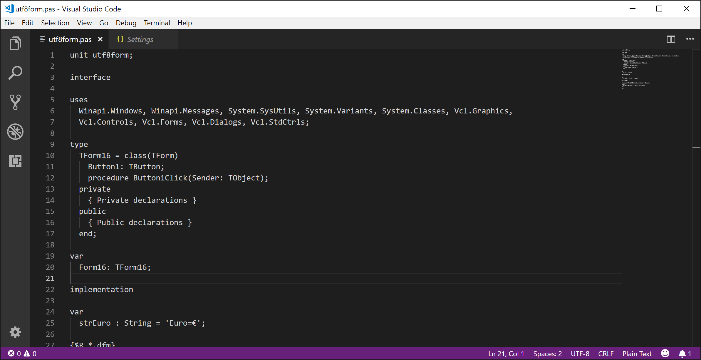
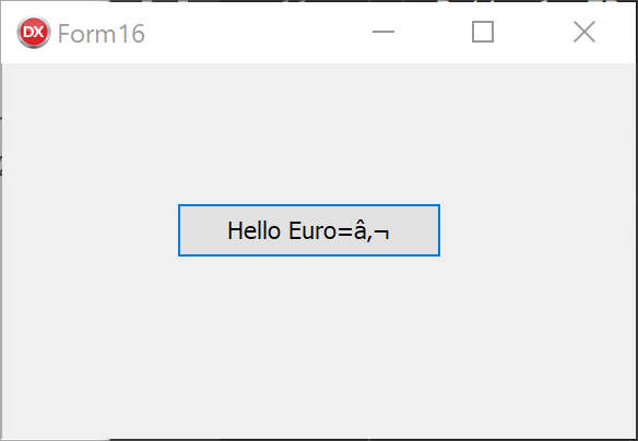
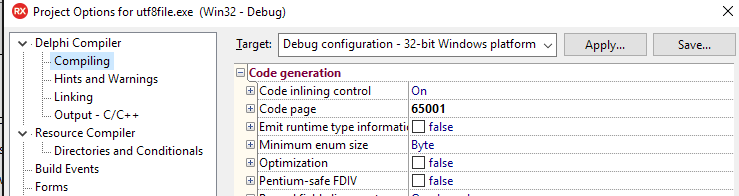
Everyone knows Delphi is the best Rapid Application Development tool. Delphi, C++Builder, and RAD Studio set the standard that everyone else is still trying to follow. Nothing will get you to market quicker with a great native experience for your users.

Delphi is also a top choice for large, long lived, and complex applications. Many of these are line of business applications that automate the internal operations of so many companies. I’ve worked on or seen a few of these large scale line of business applications over the years, and I’m sure many of you have too. Some of them are still maintained with the original version of Delphi they were written in, while many of them are moving forward with new releases adding new features and platforms.

Embarcadero Cool App ContestWe’ve been running the Cool App Contest as a way to highlight some of the cool and exciting apps that were developed with Delphi, C++Builder, and RAD Studio. Most of the entries and winners were consumer focused, like EarMaster for iPad, 1Password for Windows, Expresii, or 3D Train Studio. There were some in the Line of Business category too, like BeePOS, Where On the Map, FrameForge Previz Studio, and MalyKangurek POS. We even had some developer focused tools like BEAM, RAD & Installer, and Visuino.

But we really didn’t do a good job of highlighting large scale, internal, line of business applications. That is where this new blog series comes in. I’m going to interview architects and lead developers on some of their projects that are built and maintained by teams of developers and are core to different businesses. We’ll talk about some of the challenges they faced, why they use Delphi, and some of the more elegant solutions they’ve created.

Based on my experience some of the reasons Delphi is the ideal choice for these sorts of applications include:

  • Database Access was a key feature of Delphi from the very first release. The BDE was ahead of its time and FireDAC takes those core concepts and brings them forward to a modern, lightweight framework. Now with the REST Client Components and the Enterprise Connectors you can access data from anywhere like Salesforce, CouchBase, Google Sheets, etc.

  • A Commitment to Backwards Compatibility is something else that sets Delphi apart from so many other development tools out there. Many developers I talk to who are using other languages and tools spend a good portion of their time rewriting their programs to work with the latest version of the tools. With Delphi the changes necessary to upgrade to the latest version are minimal if any. This is because Embarcadero respects the investment you have in your code.

  • Rapid Application Development is so important in business. It gets you to market quicker, and helps your line of business applications evolve and change as your business does. When I worked at Micron Computer my co-worker was a Visual C++ developer, and he came to me and said I was making him look bad by turning around all the change requests I got with Delphi so fast. After that whenever there was a change request my stock answer was “That’ll take at least a week, but only if we’re in spacedock!” He eventually switched to Delphi as well.

Stay tuned to this series as we discuss what makes Delphi ideal for so many of these key line of business applications. I’m lining up Delphi Experts to talk with now, but am also open to your suggestions.

Why I Love Delphi


[YoutubeButton url='https://www.youtube.com/watch?v=FlocRgANzaI']


Delphi's DNA

Read More

Blogs on Embarcadero Community: Multi Tier Development and Enterprise SKU

$
0
0

I haven't blogged much here in September, because I wrote two blog posts on the Embarcadero community site (given they were more official blog posts -- I generally blog on my personal blogs and the content is surfaced on the Embarcadero community):

Build Flexible and Robust Apps with a Multi-Tier Architecture at https://community.embarcadero.com/blogs/entry/build-flexible-and-robust-apps-with-a-multi-tier-architecture: this blog post covers the evolution from client/server architectures (and their different flavors) to multi-tier models, highlighting where Delphi fits in the overall picture and how you can plan migrating your code Beyond RAD Studio Pro: Why Developers Choose Enterprise and Architect at https://community.embarcadero.com/blogs/entry/beyond-rad-studio-pro-why-developers-choose-enterprise-and-architect: this blog post is focused on the additional value provided today (and in the near future) in the Enterprise and Architect SKUs of Delphi, C++Builder and RAD Studio.

I have a couple of more technical blog posts I'll write on my personal blog, http://blog.marcocantu.com, and also a summary of the events I've been to in London and Utrecht over the last two weeks. Stay tuned.


Read More

How To Design a Great UI - Part 1

$
0
0

How do you design a user interface (UI) to be understandable and easy to interact with? In this series, I’ll give some thoughts on good design, combined with examples.

This series is intended as practical UI design advice for small teams or individual developers. Many larger teams or companies have UX staff who can advise or run the process of UI design. Typically, a UI design process would be involved as part of the feature development process, something like:

  • UI design requirements gathered as part of feature requirements
  • UX team:
    • Analysis (starting at feature analysis and how it should be conceptually presented to the user, down to smaller things like what kind of control is best for interaction or data)
    • Wireframe or mockup
    • Evaluate, refine
    • Add final design to the feature specification
  • Developer: implement design as part of feature work

But many teams don’t have access to a UX expert. The ‘UX team’ dot points above will be replaced by developers or product managers with a much wider focus. If that applies to you, then this article is practical advice to go from an initial concept (whether that’s a UI mockup, or a first-version UI created by a developer as they implement the feature) and refine it. It may not be the approach taken in a large corporation, and it won’t address graphic design or ‘good looks’ until the very final blog post, but these steps will teach you principles or give you guidelines for creating something both modern and highly usable by your users. 

We’ll start with an example of a bad UI, one based on a real-world dialog I saw recently. For the sake of this article, let’s assume this UI is either a draft / first-run UI created by a developer as the feature is being developed, or is the first wireframe or mockup of a UI as you create the specification for an upcoming feature. It may also be an existing UI that you want to improve.

However the UI is arrived at, throughout this series we’ll improve it, examining useful principles you can use to either improve your own UIs or create great new ones, in practice. If it is an existing UI, this refines it; if it is a mockup, this illustrates practical approach to the review and refinement process to arrive at a final mockup and behaviour for your feature.

UI vs UX

What do we mean by UI design?  And does it overlap with UX?

UI design is simply designing a user interface. UX is a term for ‘user experience’. Effectively, UX is the overall effect of using an application. Was it clear? Frustrating? Pleasant to look at? (Note those three things all speak to different aspects of the experience - clarity, intuitiveness or understandability, and graphic design.) It’s a broad term, but ultimately you want your application to have good UX in that you want your users to feel happy using it. Providing an intuitive flow to your application is key for new user adoption and retention, and well thought out UX provides that. That’s also a reason why a growing number of companies perform UX testing with focus groups during their application development cycle to ensure a good user experience.

UI design is a key part, but is not the whole, of good UX. This series focuses only on designing your user interfaces.

In addition, this series focuses on practical UI refinement, and on usability. Shiny good looks are left to the very last post.

Basic principles

Let’s begin with some basic principles that will be elaborated on through the series. We will look at specifics as we go through the series and improve the example ‘bad’ dialog in practice.

Some higher-level principles are:

  • Function not looks. A well-designed UI does not mean that it is pretty. There are many nice-looking UIs which are hard to use. We will examine how to make a UI look aesthetically pleasing, but this is one of the last steps in improvement. 
  • It’s all about understandable data. A UI is all about data onscreen. ‘But I don’t have data’, you might say - yes, you do. Any content shown to users (items in lists, previews in ribbons, text in an editor, the caption of a checkbox or button, etc) is data. Because it is about data, UI design is about clarity. Make the data presented onscreen understandable, and a have clear effect for all possible actions
  • Communicate relationships visually: a UI is not just boxes placed onscreen, but related boxes placed onscreen. Understand the relationship between data shown onscreen, and use visual layout to communicate that. Grouping into logical categories is a great way to add structure to your UI.
  • Simplicity is not clarity.  Simplicity, such as only a few controls, does not mean it is clear. A cluttered UI also has that effect, so striking the right balance is key. It is common, if you are used to desktop design, to use too many controls when designing your first mobile UI. Similarly, you may try to follow modern desktop design by using a sparse layout, mistaking few controls for use of whitespace. Both these can be mistakes.
  • Be cautious in innovation. Try not to invent new controls or styles. They may be fun but can be confusing to the app user. Usually, your operating system or UI library will provide premade controls that users are familiar with. For example, Windows 10 provides some new controls (switches and calendars, also provided by the VCL) that while new in the OS, are not new in that users are already familiar with the concept, and by being used throughout the OS are quickly standardized. Following OS UI guidelines and using common controls ensures quick understanding of a UI, thus increased usability for your users.
    And very related is:
  • Copy what other people do. Follow conventions; don’t surprise the user.  If there’s a common pattern in other UIs, use that. Users will understand it.

What is an intuitive UI?

The last two points are related to ‘intuitive UI design’, something often mentioned, meaning a UI that users can pick up and understand without preconceptions.  A large amount of what is ascribed to making a UI ‘intuitive’ is in fact not a new concept easily understood; it’s familiarity, meaning people ‘intuitively understand it’ not because of some magic design that makes it truly intuitive, but because they already know how to use it, even if they don’t realise that.

Almost no-one invents truly intuitive new paradigms; it happens maybe once or twice a decade. Many of the criticisms of current UI design trends, such as Material Design, revolve around removing cues that provide familiarity.

When the iPhone was released, Apple had in-phone training to teach users the new paradigms. Many things were intuitive: they were modeled on physical interaction (skeuomorphism), such as buttons being 3D and looking as though pressable, or lists being able to be flicked to scroll.

‘Pull to refresh’, one of the most common mobile interactions today, was invented in 2008 by Loren Brichter for Tweetie, a Twitter client. It’s a great example of a non-skeuomorphic interaction paradigm, in that in the real world lists do not have items appear at the top, but scrolling to the top of a time-sorted list is the obvious place to discover more recent items.

Intuitive UI Case 1: Mobile OS Back Buttons

I recently saw a friend, an Android user, pick up my iPhone and try to go ‘back’. For a few seconds, their thumb hovered over the bottom left of the screen and they audibly said, ‘ah…’ in a confused tone, before hitting the Back button on the top left.

Android: the Back button is
on the lower left, and is hidden
until applicable. It is a symbol 
only.
iOS: the Back button is onscreen
as a UI element, is always shown 
in any UI where you can go back,
and has a text caption.


Is this an intuitive UI? From learning, from use of Android, they expected to go back through interaction on the bottom left of the screen.  There are a few interesting things to unpack here:

  • Android uses an unlabeled triangular symbol to go back. It needs to be learned, but once learned, people are used to it
  • iOS uses a left-facing chevron, and it is labeled Back. This makes it discoverable for people searching for the functionality: it is objectively clearer than the Android design
  • Back in both OSes is on the left, and the direction indicator faces left. This mirrors Western physical textual UIs, books, where earlier content is accessed by paging left.
  • Neither are implemented as a traditional button: that is, something with a UI indication that it can be tapped or pressed (a 3D look.)

The last point is one of the most significant criticisms of current UI design trends: removal of subtle indicators. This isn’t always a problem - consider toolbars in desktop apps, where in the late nineties, starting with Office 97, they were rendered without 3D borders by default. Later, even the mouseover 3D borders were removed and today it’s common for them just to highlight with a solid colour when moused over. People have learned that images in a horizontal row are usually clickable, so any toolbar today is ‘intuitive’.

Many current trends have images in many random places, some of which can be clicked and some cannot. There is no way to visually tell the difference. That is unintuitive design.

In this situation, the iOS button is both standard in all system apps, and has text. Both of these mitigate the loss of visual indication of interactivity from earlier iOS designs where interactivity was indicated by drawing it like a physically interactable item, a button. (This is called skeuomorphism: physical metaphors in digital, 2D UIs.)

Intuitive UI Case 2: Google Calendar Edit Button

This is Google Calendar’s popup window when clicking on an event:

It has a title, and some details in smaller text.

There is also a row of buttons to interact with the event in a number of ways at the top: close, delete, email, and a hamburger item to see more: a toolbar, a familiar interaction.

How do you edit the event?

The Edit button is nowhere near any other interaction.  It is halfway between the title and details, and has almost the same background colour as the title background, making it hard to visually spot - it does not stand out.

What’s wrong with this?

  • It is inconsistent: editing, an interaction, is in a different location to all other interaction
  • It is visually difficult to see, it is camouflaged

A better design would place the edit button near other interaction but, recognising it is the most important and likely to be clicked of all interactions, make it more prominent:

Here, Edit is an action on the toolbar like all other actions. It is found when looking at the list of interactions: it is no longer standalone and needing to be discovered separately. Because it is the most important, it is placed first, and it is annotated with a text label so it is clear - you do not need to interpret the pencil icon to know what it does.

The original is a great example of an unintuitive UI: a specific interaction needs to be learned, and you cannot apply rules you already know (toolbar buttons in a row, look for interaction with other interactions) to this case, nor is it visually distinct or called out.  It is a once-off, unique action, camouflaged. 

Principles In Action

Those principles may sound good, but describing visual design in words is not as useful as showing it implemented in practice to turn a badly designed UI into a clean, modern, understandable and intuitive UI.  Over the next couple of posts, we’ll look at an example badly designed UI and improve it, following the principles above.

Starting point: A ‘bad’ UI

The following image is inspired by a real-world dialog I saw recently. This screen, as shown below, has been anonymised and has an entirely made-up purpose: it is a dialog to export books to file, with various formatting options. Have a look:

This UI presents a list of books. For the selected one, a list of chapters; then some formatting options, and some fairly standard dialog buttons. It is not complex. Yet, looking at it, a user might have a number of questions:

  1. Why am I selecting chapters? Am I, or are they just being displayed?
  2. How do the formatting options interact? What if I check both Black and White and Sepia? Or Sepia and Invert Colors - will I get something mostly blue?
  3. Can I select multiple books?
  4. What selection does ‘Invert selection’ invert?
  5. How does that work, anyway? If I uncheck it, will it change? What if I change my selection in the meantime?
  6. What does Apply do?

Questions like these indicate confusion.  This is a simple UI, with only a few controls, yet it creates uncertainty. You want to empower your users, and make them feel they understand what they’re interacting with and what they’re doing. A dialog that causes questions is a good indication that the UI is suffering from some design problems.

We will use this dialog as our starting point, and improve it throughout the series.

Next steps

Next post, we’ll see some guidelines on how to analyse a UI and discover an underlying structure that can be clearly presented. That structure can then be reflected in the UI design. The ‘bad’ UI mockup we have will be refined.

Until then, the exercise of asking questions about a UI is a good one. Try picking one of the dialogs in an app of yours, and approach it trying to know nothing about it. What questions, like the above list, can you come up with? Pretend you’re tired, have not yet had a coffee, and are unfamiliar with the app -- and see what questions you might ask.


Read More

Photos of September Delphi Events: London and Utrecht

$
0
0

Delphi User Group Meeting, London

A couple of weeks ago I was in London for personal reasons and teamed up with the UK Developers Group to attend their monthly meeting and talk about Delphi. I offered an introductory talk, some in depth on RAD Server compared to other web service technologies, plus some FireMonkey and VCL insights, and a deep dive on some advanced features of the Delphi language.

This was a very nice event set up in a pub (and including the pub's food) in Camden. Here are a couple of pictures taken by the organizers -- and thanks a lot for the invite. I'll be back!

Delphi Conference, Utrecht

Later in September I traveled to the Netherlands, Utrecht to be precise, for a large Delphi conference organized by Embarcadero partner Barnsten. The turnout was very significant, with over hundred attendees, and there was also a very nice group of speakers beside myself (see photos below). It was a nice event, and attendees were happy to see a large crowd -- a good sign of the health of the Delphi community in Europe.

At the conference I gave a keynote on the status and plans for Delphi, and a technical session focused on RAD Server. Again, here are some assorted picture I took or including myself.

Coming Next, EKON 22

Next I'll be at EKON 22 in Dusseldorf, Germany, early November.


Read More

Save this Page: All the Patches Since the Last Release

$
0
0

How can you be sure you’ve applied the latest updates for your RAD Studio, Delphi, or C++Builder version? After installing the IDE, there may be updates that were released since the last product installer.


Patches for Version 10.2.3

You can find all of the patches since 10.2.3’s release listed here (Bookmark this page!):

http://docwiki.embarcadero.com/PlatformStatus/en/Main_Page#RAD_Studio_10.2.3_Tokyo


If you installed 10.2.3 after July 18th, 2018, you already have all of the patches that were released through July 13th (current as of today, October 3, 2018). Here is a description of that installer: http://docwiki.embarcadero.com/RADStudio/Tokyo/en/10.2_Tokyo_-_Release_3


Patches for Versions 10 (Seattle) through 10.2.2

Bookmark the same page: http://docwiki.embarcadero.com/PlatformStatus/en/Main_Page and use the right hand menu to find your IDE version and any released patches.


Stay Current on Update Subscription

Of course, if you’re on Update Subscription, you get the latest product releases with all of their new capabilities. This year we’ve seen significant enhancements:

  • Version 10.2.3 added mobile development support to all Professional Editions

  • Version 10.2.2 added RAD Server single-site deployment license to Enterprise and Architect editions

  • In August 2018, Architect editions upgraded their included RAD Server licenses to multi-site deployment licenses.


There’s so much more planned for the upcoming 10.3 release, and Update Subscription users were invited to join the beta testing to try them out.


Never miss a new release again: renew your Update Subscription. All new purchases include the first year of Update Subscription, so you’re assured of any new product releases for an entire year!


Read More

How To Design a Great UI - Part 2

$
0
0

Welcome back! Last time, we discussed a typical UX design flow, and how to tackle this if you do not have access to a UX designer. We also looked at some key usability principles, and saw an example ‘bad’ user interface that we will improve step by step through this series. Finally, we examined that bad UI and some of the questions and confusion a user might have when interacting with it. If you haven't read the first post, please do - it covers some essential topics before what's covered this time.

This post, we’re going to examine the ‘bad’ UI critically in order to understand its purpose, and then how to structure the UI to better implement that purpose. At the end of it, you should have seen a good example of ‘getting into the user’s head’, or examining something from your users’ point of view in order to understand it how they understand it. The UI we end up with will still look very ugly, but the core redesign to improve its function - focusing on understandability and usability, not looks - will be complete.

Answering Questions and Solving Confusion

To solve your confusion, you must first be confused.

Sound like an inscrutable piece of pseudo-philosophical advice? Here, it means that we need to understand why our users may be confused, or understand how our users perceive a UI. From that, we can make it clearer. It is very hard to make it clearer without first understanding what makes it unclear.

As a developer, or anyone closely tied to development like a designer or product manager, it can be hard to put yourself in your user’s shoes. You’re very familiar with the software, and likely understand it inside and out.

How do you view your software with user’s eyes? It’s difficult, but I’ll share my own approach here.

It’s important to remember that your users almost always won’t know the software as well as you do, and won’t understand why something works the way it does. What they will see is what is presented - which is the UI. There won’t be knowledge about why things are presented a certain way (reflecting the underlying data, for example). All users will see is what’s on screen.

Second, the underlying data structure or the way your program is architected has nothing whatsoever to do with how the user expects it to work. Someone approaching software will not be aware of its internals.

When viewing a UI, this means you need to drop everything you naturally already know about the software. Forget how it works. Forget even what it does because that too may not be known to a new user. Instead, approach it with an aim: “I want to use the software to do X.” This is a use case, and your features will have been built to allow specific use cases, but try to come up with one that isn’t a design case rephrased.

Thus, the best way to enter a user’s head, and see confusion that they may see, is:

Approach it with an aim. You are a user trying to use the software to achieve something. Your task is to figure out how to use it.

Questions about the example ‘bad’ UI

Let’s revisit our sample bad UI:

This is a mockup, or an initial draft created by a developer when implementing the feature.

We know this is software to export a book. One can infer there were a number of use cases for the functionality this dialog exposes, probably along the lines of:

  • User wants to export one or more chapters to their Kindle

  • User wants to read in white on black text, for easier reading at night


But we should forget those.  For our own UI design, what is our aim? Be specific: you are using it for a purpose. “I want to save my copy of Solaris to PDF.”

A user with this aim can now begin to ask questions about the dialog. Some of these questions will prompt changes to reduce confusion.

Questions

1. What is the purpose of the dialog?

To export books.

2. Ok, then why is it called Format Chapters?

I don’t know.

3. Why does it list the books?

In this app, there is probably a book list elsewhere - not shown here, but likely a list of books in a book collection application. Most likely, you would would select or multiselect, and click an Export button or menu item to show this dialog. This dialog is not the main app. So why are the books listed here?

The answer to the question is: I don’t know. Nor does it make sense.

This gives us an action item: Remove the book list from the UI.

Now we’re getting somewhere. Working assuming that the app lists books elsewhere, we found a point of confusion we can answer. Here, we can remove the list of books from this dialog, because it exists at a previous level in the app. This simplifies the UI, yes, but more importantly it simplifies the function of the dialog.  The dialog is no longer also a book selection dialog: it is now only a book export dialog.

4. Why does it list chapters?

Listing chapters implies a use case of only exporting some chapters. Is this valid? How often do you want to export only chapter 5 of your book to your Kindle? Not often, but it may be valid for textbooks, for example. If this is a valid use case, the functionality is valid and we need to consider how to reduce confusion without removing the function.

5. Ok, but how is exporting specific chapters handled when exporting multiple books?

Again a good question. One possible solution is to allow choosing chapters only when exporting a single book.

6. How do I know which chapters I’ve exporting?

It's hard to say.  Ok, let's make it clearer: say, checkboxes next to the ones to export, and add buttons to check/uncheck all chapters.

This is an example of making the UI familiar. Currently, you have to highlight or select chapters - and noone would guess that. You rarely select items as squares in a grid (this does happen in some Explorer views.) More often and so more familiarly, you select items in a list, or you check or uncheck items in a list. We’ll go with the second, since a selection is fragile (click the wrong place, you destroy it) and we are choosing items, not selecting and interacting.  

Another action item: replace the chapter list with a check list box.

All chapters should be checked by default, making the default to export all. The reason is that usually you’d want to export an entire book.

7. There’s a lot of questions here about exporting just some chapters

Yes! So this feature itself is really confusing. This is a good insight and might lead us to redesign the app's flow entirely. However, in this case, since we're only examining one dialog, we won't. We know the feature is important, but it’s a less common use case than exporting an entire book. Yet it appears that we need to check all chapters (or verify they are all checked by default) just when wanting to export a whole book.

This is an example of unnecessary choice. If someone wants to export an entire book, they have no need to select chapters. They also don’t want to be asked what chapters, because that will be an area of concern - ‘Am I exporting the whole book?’ is a type of ‘Am I achieving what I want to achieve?’ and that’s a bad question to prompt.

Let’s make this clearer. We have another action item. Use two radio buttons, one to export the entire book, and one to export parts of it. This makes the choice clear. The chapter selection is only entered into if actually desired.

The use of specific controls, such as why a radio button not a combo box or some other control, will be discussed in the third post.

8. That formatting is confusing: invert colors, black and white, sepia? What if I choose sepia and invert, is it blue?

Blue is perhaps the best result of inverting sepia, because another and more likely alternative is that there’s an error message when clicking Export. The user did something completely logical and following the rules - checking two checkboxes, which are not presented as contradictory but are next to each other. Yet clicking the action button on the dialog will likely give an error - indicating that the user did something wrong. This is not the case. The user did not. Giving an error for behaviour your UI presents as valid is user-hostile.

We can simplify this by making the color options a list:

  • Black Text, White Page
  • White Text, Black Page
  • Dark text, Sepia Page

This is much simpler to choose from. This would likely be presented as a combo box, though we’ll examine how to match specific controls to choices in the next post. This combo will have a label indicating what the combo contains, that it controls formatting. This can be implied from the combo contents (especially since we've labeled them so well, 'Black Text, White Background' rather than 'Black and White'), but it adds clarity.

9. What does Apply do?

That’s a very good question. The purpose of this dialog is to export, and it has an Export button. Apply just doesn’t make sense. Saves the settings, perhaps?

Another action item: Get rid of the button. The last exported settings will be saved.

The Export button is already clear. It’s good to label by function.  ‘Ok’ or ‘Cancel’ are common pairs, but there’s no need to stick with them, especially Ok. Use single-word actions: Export, Save, Delete.

Changes based on questions

Based on approaching the dialog with our aim in mind, and asking questions, we came up with the following changes:

  • Remove the book list from the UI. The book or books are chosen in the previous part of the app (perhaps where it lists all books in your library). The dialog is now not a book selection dialog; it is a book export dialog -- only. Single purpose.
  • Allow selecting which chapters to export only when exporting a single book. If the dialog is opened from multi-selecting books, you can only export them whole.
  • The chapter list should make selection to export clear: change to have checkboxes next to each chapter.
  • Clarify if the user wants to export chapters at all. Mostly, they probably want to export the entire book. Give them that choice as a higher-level option than the chapter selection, and make exporting the whole book the default. We chose two radio buttons.
  • Change the color options to a list, of which only one can and must be chosen. This combo box has a caption, because it is important to indicate, in a list, what you are choosing.
  • The Apply button is purposeless; remove it.

Applying these changes, we now have a dialog that is more functional and easy to understand.  Looking at it prompts fewer questions. Behaviour is clear.

If you examine that UI, you have fewer questions about how it works, or how to achieve the goal of exporting your book. It is, objectively, a clearer and more usable user interface.

It still does not look nice.  It is not pretty.  It is badly laid out.  It does not look modern.  Looks are the very last part of UI design: achieving the user’s aim, their use cases, is first.

Summary

In this post, part 2 of the series, we looked at an approach to see your application with fresh eyes: to forget your knowledge about the internals and approach using it with an aim. Then, we applied this to the example ‘bad’ UI and made it significantly easier to understand. It is still ugly and not pleasant to look at. That, and other refinements, we’ll look at in the third post.


Read More

The Delphi Compiler and UTF-8 Encoded Source Code Files With no BOM

$
0
0

Last week a (large) customer sent me an email indicating he was experiencing issues when compiling the same project on different machines. Turned out the difference was in the source code files format and the root cause was a unit saved as UTF-8 but without a BOM. The reason? One of the developers is using Visual Studio Code... and the solution is a chancing that or using compiler flag. But before I get to the solution, let me show you the problem with a very simple test case.

Delphi and Source Files Encoding

To test the scenario, we (it was one of the architects who came up with the simple scenario) created a simple VCL application with code like the following:

var strEuro : String = 'Euro=€'; procedure TForm16.Button1Click(Sender: TObject); begin Button1.Caption := 'Hello ' + strEuro; end;

By default, the editor in the Delphi IDE uses ANSI encoding, and everything works fine. You can use the editor context menu, pick the File Format submenu, select UTF8 (I know, missing -), and everything keeps working as expected. Notice, though the length in bytes of the string changes, as you need multiple bytes to represent the Euro symbol in UTF-8.

Enter Visual Studio Code

While many modern editors use UTF-8 as their standard file format, a nice option we are considering to default to also in RAD Studio, Visual Studio Code (or VSC) is one of the few that prefers using UTF-8 with no BOM. The BOM (Begin Of file Marker) is a sequence of bytes (3 bytes for for UTF-8) that marks the file to make it simple for an editor or a tool processing the file (like a compiler) to figure out the internal format. Given the similarities in many cases, you might have to read an entire file to see if it is UTF-8 or ANSI encoded.

When you open a Delphi unit in VSC, it keeps the formatting. If it is UTF-8 with BOM, it remains as such. But for a new file the default is UTF-8 with no BOM. And any file can be saved with that format, as you can see in the status bar options:

Now if you do this, compile the application again, you'll get a nice caption for your button, rather than the Euro symbol:

Use a BOM or a Compiler Flag

Once you realize the issue, the solution is not that complex to achieve.

On one side, you can make sure your editors save the UTF-8 files with a BOM. The compiler sees it, and all works fine.

On the other side, you can tell the compiler to consider the source code file as UTF-8, regardless of the BOM. You can do this using the compiler flag:

--codepage:65001

or setting the codepage in the compiler options to that value:

Good Work Around, Future Solution

I hope this will help you avoid a similar issue. We are researching making the codepage detection automatic, so that the compiler could automatically pick up the right option. But not something we plan to addressing shortly... as the R&D team is busy with the coming release.


Read More

FireDACの秘密:最後に挿入された自動生成IDとEnterprise Connectors

$
0
0

この記事は Eli M. による Secrets Of FireDac: Last Inserted Auto Generated Id And Enterprise Connectors の抄訳です。

 自動インクリメントフィールドがあるテーブルにデータを挿入するとき、一般的にはSQLクエリを使用して新しく作成されたレコードの最後に挿入されたIDを取得します。TFDQueryを使用してINSERTクエリを実行し、続いて、SELECTクエリを実行すれば、新しく挿入された自動インクリメントIDを取得できます。

異なるデータベースには、これを実現するために異なるSQLクエリがあります。 たとえば、MySQLには、LAST_INSERT_ID(例:SELECT LAST_INSERT_ID))という名前で実行できるSELECTクエリ関数があります。 このSELECT文を直接実行するか、FireDAC内蔵の機能を使用することができます。

FireDACには、GetLastAutoGenValueというTFDConnectionコンポーネントから呼び出すことのできる関数が用意されています。 Oracle、InterBase / Firebird、MySQL、MSSQLなどのデータベースをサポートし、最後に挿入されたIDを返します。 それは、最後に挿入されたIDを返すために、異なるデータベースごとに一意のSQLクエリを使用します。 以下はDocWikiのものです。

GetLastAutoGenValueメソッドは、最後に自動生成された値を返します。 意味と結果は、次の表に示すようにDBMSによって異なります。

DBMS

説明

Oracle

AName はシーケンスの名前です。セッションに存在する場合、CurrValue を返します。

InterBase/Firebird

AName はジェネレータの名前です。GEN_ID(0) を返します。

MS SQL Server、MySQL など

セッションで最後に自動生成された値です。

CData社によるEnterprise Connectorsは、実行中のバージョンでGetLastAutoGenValue関数をサポートしていないようですが、SCOPE_IDENTITY()と呼ばれる独自のSQLクエリを持っています。(例:SELECT SCOPE_IDENTITY())。 私はCData Salesforce Enterprise ConnectorでSCOPE_IDENTITY()関数を使用しました。 SCOPE_IDENTITY()は、FireDACのCDataヘルプファイルにはあまり記載されていませんが、ヘルプファイルのSELECT構文で表示されます。


//
SELECT {
  [ TOP  | DISTINCT ]
  {
    *
    | {
         [ [ AS ]  ]
        | {  |  } .*
      } [ , ... ]
  }
  [ INTO csv:// [ filename= ]  [ ;delimiter=tab ] ]
  {
    FROM  [ [ AS ]  ]
  } [ , ... ]
  [ [ 
      INNER | { { LEFT | RIGHT | FULL } [ OUTER ] }
    ] JOIN  [ ON  ] [ [ AS ]  ]
  ] [ ... ]
  [ WHERE  ]
  [ GROUP BY  [ , ... ]
  [ HAVING  ]
  [ UNION [ ALL ]  ]
  [
    ORDER BY
     [ ASC | DESC ] [ NULLS FIRST | NULLS LAST ]
  ]
  [
    LIMIT 
    [
      { OFFSET | , }
      
    ]
  ]
} | SCOPE_IDENTITY()


Read More

C++ Libraries in GetIt: MurmurHash 3

$
0
0

An ongoing project we have is to ensure more popular, well-known C++ libraries are updated to work with C++Builder, and available to you from within GetIt, our package manager. You may have seen a post earlier this year about real-world (non-demo) apps that you can use with C++Builder and CMake, for example, and this is related.

This week, I'd like to highlight MurmurHash 3.

MurmurHash is a very well known hash function (read its Wikipedia page). It can produce either 32-bit or 128-bit hashes of input data, and is famous for being fast and reliable.

Both MurmurHash 3 and its test suite, SMHasher, are available on GetIt.

When you use RAD Studio, you can mix C++ and Delphi code together. I have a blog post, video, and example source code for doing so, in both directions - adding Delphi to C++, and adding C++ to Delphi! If you want to make use of C++ libraries from within Delphi, check those out, and look into making use of RAD Studio.


Read More

How To Design a Great UI - Part 3

$
0
0

Welcome back! This is the third post on a series on practical UI design, an approach to creating usable, good-looking UIs when you are not a UX expert.

In Part 1, we looked at some basic principles of UI design, a typical UI design workflow, what it means for a UI to be ‘intuitive’, some examples, and started with an example ‘bad’ UI that could be a first cut at a UI for a feature, or the first version of a mockup.

In Part 2, we moved into a practical approach, and examined confusion from users’ eyes. Using the ‘bad’ UI, we asked questions about it, several of which led to changes in the UI. These changes were only functional: they changed what the UI did, or what data it presented, but did not focus on how the dialog looked.

This post, Part 3, will be the last in the series for a while -- although there are several followon topics. In this post, we’ll improve how data is presented and how the controls interact with each other and with the user. We’ll also examine making the dialog look more standard on Windows, such as layout and form behaviour, plus a ‘recipe’ for things to do when implementing a dialog. We’ll also, as a brief aside, examine the role of specific controls and when to use them. Then we’ll have another aside, about the role of animations in UIs. Finally, applying all these, we’ll have the final UI. Will it be great? It may not be flashy, but it will be clear, modern, elegant, and usable.

Control interaction and data presentation

Last time, we got to this ugly-looking, but more functionally understandable, dialog:

Here, the UI controls are clear in function (their purpose), but there are improvements we can make in how the interact with each other and how data is presented.

Control interactions

One goal is to reduce uncertainty. A control that can be interacted with is potentially a control that should be interacted with. (‘Surely it’s there for a reason?’)

In addition, controls should represent the choices a user has made. This provides confirmation to them that their choice is being applied.

We have two reasons now to modify controls: to clarify applicability, and to confirm interaction.

Controls can be modified in all sorts of ways, right up to removing them - usually a bad choice, because a control vanishing is surprising, violating our principles of reducing surprise. But one common change, especially on desktops, is to disable a control. This typically draws it gray or flat, or with some other visual indication that it’s there but cannot currently be interacted with.

A good time to enable or disable controls is in response to state changes, such as what’s selected or chosen. What controls in the UI above change applicability (are they of use or not?) based on choices the user has made?

There are two sets of controls:

  • The chapter list. Selecting chapters is only applicable when the user has chosen that they want to export specific chapters, not the whole book. When exporting the entire book, the chapter list and the Check All and Uncheck All buttons should be disabled.

    • A further tweak here would be to enable Check All only when not all chapters are checked, and Uncheck All only when there is at least one chapter checked. Otherwise, they are available when clicking them will have no effect. Not only is this useless, but their availability implies to the user that there is a reason they are enabled, ie, Check All being enabled implies that there is at least one chapter unchecked. If this is not true, a user, comparing the button and scrolling through the chapter list to find any unchecked chapters, may become confused.

  • The Export button. This should only be enabled when there is something to export. That’s true most of the time, but there is one situation when there is nothing to export: when the user is exporting only specific chapters, and has not selected any of them.


Implementing enabling and disabling these controls is another action item.

Data presentation

A UI is all about data. Data is what it shows. You may feel yours don’t, if you are just presenting options to a user or not working on a complex app, but ‘data’ just means information. A UI is redolent with information. The book we’re exporting is information. The chapters it has are information. Choices the user makes, such as exporting the whole book vs some chapters, are information. Actions, like ‘Export’, are information.

In part 2, we examined the dialog while asking questions, and the answers to those questions reduced uncertainty and reduced confusion. Presenting information to the user is a good way to reduce uncertainty. You do not want to present unnecessary or redundant information, but present what is useful to know, or what a user may ask.

Here, one question we cannot answer from what’s displayed in the dialog is, What book is being exported?

Before seeing this dialog, the user will have selected a book or books and then invoked this dialog. Although that was likely only seconds ago, confirming their selection, or showing it if they are returning to the app after some time, is useful. The book being exported is extremely pertinent to the purpose of this dialog, which is to export that book. Therefore, it is good information to display.

You could show that information in multiple places. One option is a label at the top, perhaps above the radio buttons. However, we will show it in the title bar. The title bar of a dialog names the purpose of the dialog, and the purpose of this dialog is to export a book. (Note it currently says ‘Format chapters’, which is not accurate.) Our action item is to title the dialog, Export ‘Book Name’, such as Export ‘A Canticle for Liebowitz’.

Applying UI standards and design

We now come to the section that has the greatest impact on the UI’s look. This series has deliberately left the visual side of UI design until last, and that’s for an important reason: good UI design isn’t only about looks. The function, purpose, and flow of a UI should be designed first.

However, looks are important. Not only for consistency with the target platform, but also to look attractive. People judge by looks, even unconsciously, and presenting a UI that looks well designed will positively impact your user’s perception of your application.

We’ll examine two areas: standard dialog behaviour you should always apply, and some tips for designing a ‘modern’-looking dialog.

Modern Design

Recent design trends are often characterized as ‘flat’, and that is true: there is a lot of removal of 3D borders and, sometimes more concerningly, indications of interactivity. Depending on the platform, there are a range of other ‘modern’ trends: single color UIs or icons, small shadows to replace previous 3D bevels, semitransparency, removal of gray backgrounds in favour of white or other solid colors, etc. These are platform-specific.

But modern design has another aspect, specifically, use of space. Increasingly, UI elements have larger boundaries between them. Spacing is useful for ‘relaxing’ a UI: a cramped UI evokes frustration. It is also useful for denominating related areas without using explicit border lines. Sometimes, different areas have different spaces, and borders are now no longer denoted with lines, but by colored areas.

Let’s look at this for a typical modern Windows dialog. A typical Windows dialog has a white background, not gray. In practice, this means clWindow, not clBtnFace. Items inside will have a large border between them and the dialog edge, and will be well-spaced between each other. It also has a separately colored area at the bottom for buttons. Here, clBtnFace can be used, as could any other light accent color.

You can implement the button panel with a TPanel with ParentBackground and ParentColor set to false, and its own Color to clBtnface. Place buttons and anchor them right (more on this in the recipe below.)

Recipe: a checklist for dialogs

To achieve a standard-looking and behaving dialog, in the VCL designer, follow these steps:

  • BorderStyle: bsDialog. This changes the title bar look and gives it only an X button

  • Color: clBtnFace (default, old style) or clWindow (modern)

  • Position: poOwnerFormCenter. If, when shown, it is owned by the form the user is currently using, this will pop up your dialog over the middle of that window. Also try poMainFormCenter.

  • Buttons:

    • Main ‘Ok’ button (or similar, such as Export):

      • Default: true. This invokes it when the user presses Enter

      • ModalResult: mrOk. This allows you to test what button was used to close the dialog, from code that shows the dialog with ShowModal

    • Cancel button:

      • Cancel: true. This invokes it when the user presses Escape

      • ModalResult: mrCancel

    • Buttons are not centered at the bottom, but are on the bottom right of the dialog. Indent at least 20 pixels from the right hand edge. Use Anchors to anchor them right, not left. 

  • Ensure default options are checked, selected, etc by default

  • Check the tab order. Right-click on each owner control (the form itself, and panels) and select ‘Tab Order…’. Ensure tab order goes, roughly, left to right, top to bottom. The panel with Ok and Cancel buttons should be last.

  • Place labels above controls, not to the left of them. (See the ‘Formatting’ label in the final dialog design.) This is a more modern style. It also assists internationalization, as you don’t have to worry if there is space for translated text.

  • Add keyboard shortcuts for controls: an Alt+(Key) combination that sends focus to the control. To do this, in the label for a control, add an ampersand before the key. For example, ‘&Formatting’ will use F. F will be drawn underlined by Windows when the Alt key is held down. Then, set the FocusControl property to the control that should be focused.

  • Spacing:

    • Place controls indented at least 24 pixels from the left, top, and right edges of the form

    • Use a multiple of 4 for spacing: for example, controls may have a 4px, 8px, etc gap between them, and be placed and sized to multiples of 4. The exception are buttons, which are 75x25 by default.

    • For related controls, have a 4px gap between them vertically, 8px horizontally. See the chapter like, and Check All and Uncheck All buttons: 4px vertically between the list control and buttons; 8px spacing between buttons.

    • Indent controls underneath radio buttons or checkboxes, or other controls, that affect them. For example, the chapter list is indented under the radio button that enables it. To align with the text in a radio button or checkbox, indent by 16px.

    • Align controls visually, especially at their left and right edges. For example, the Ok and Cancel buttons on the bottom will be indented by 24px from the right hand edge. Controls in the main area of the form will also be indented 24px, and will visually line up

  • Make use of the Alignment and Anchor controls.

    • Alignment makes a control stick to, and fill up, an edge or the center of its parent control. This is useful for parent controls like panels, or large controls like edit boxes or lists.

    • Use the AlignWithMargins and then Margins properties liberally. These are excellent for applying spacing. They are also useful for making a control stick to the top (say) of a form, but with a large margin other controls can float in.

    • Anchoring doesn’t make a control fill an area, but makes it stick to an edge with the same distance. For example, something anchored right will stay the same distance from the right edge of the form when the form is resized. You can anchor to both left and right to have both sides stick, and the control change size


You can use this as a checklist for all dialogs.


Applying Changes

After applying all the above, this is our UI:

A major change from the original draft or mockup we started with. It is not flashy, but it is usable, clear, matches our platform (Windows) well, has some modern design cues, and is a vast improvement. You too can improve your dialogs by following the steps and recipes in this series.

The role of animation in UI design, and a controversial tweak

Animations are useful for attracting attention to an area. For example, in the Parnassus Bookmarks plugin (disclosure: I wrote it), when you add or remove a bookmark in the code editor there is an animation showing it appear on the side, or showing it vanish. This is a visual clue indicating its location, and also visual confirmation of the user’s interaction, which is invoked by a shortcut key and has no other visual response.

Animation can similarly indicate a change in state - again, movement used to catch the user’s eye and to draw attention to something important. If state changes, a visual transition can also reduce surprise, because the change from one state to another is visible rather than instantaneous.

Animation can be annoying if overused. This is Skype for Mac during a Skype call, where an emoji icon constantly animates:

Don't be like that!

Controversial UI tweak

In the ‘Control Interactions’ section we disabled the chapter list when the user chose to export the whole book. Let us suppose that we analyse user’s usage of the dialog (something we haven’t discussed much, but is important) and it indicates that 95% of the time, users export a whole book. Exporting individual chapters is rare. There are a number of possible responses to that, including making this dialog handle whole-book exports only, but for the sake of demonstrating a potentially controversial change, let’s assume we keep the dialog as is.

Instead of disabling the chapter list, we can hide it, and only display it when the user chooses the radio button. When hidden, the space it takes up would be blank, so hiding it implies the dialog size should be changed to be considerably less tall, and so the dialog as a whole will change size when the user clicks each one of the radio buttons.

This violates the principle of not surprising the user.  It is not normal for dialogs to resize on Windows.


However, animation including sizing and showing/hiding elements is slowly becoming more accepted on Windows, especially in Fluent Design apps. So let’s implement it in this dialog. When the dialog is shown, the option to export the whole book is chosen (as it is the most common choice) and the dialog is collapsed. It expands when the other radio button is chosen.

It is essential, if you implement something like this, that the dialog resize is not instantaneous. Show the user the change. That is, smoothly animate the resize. Transitions are their own complex topic, but do not animate linearly: implement a transition that eases in and eases out, so it is visually a smooth transition.

Final words

There are some common themes running through this series. When we changed the dialog title, we gave pertinent information, and reduced potential uncertainty for our user about what book they were exporting. When we changed control interaction, we used common UI patterns like disabled controls to make it clear what could be interacted with and what the workflow within the dialog is, again reducing uncertainty. In part 2, we dedicated almost an entire blog post to asking questions about the dialog, especially around its purpose and function, to reduce confusion.

I am sometimes asked what I believe good UI design is. It’s not just aesthetics, although pleasant visuals are good. The most fundamental goal of good UI design is: Reduce uncertainty; add clarity.

This has been a practical guide, but with that as your goal, you can achieve 99% of good UI design with ease.


Read More

Dave's Thoughts on UI Design - Index

$
0
0

I'm a big proponent of practical, usable UIs that are easy to understand and pleasant to look at. As an ongoing series, there are a number of blogs posts on UI design.

How To Design a Great UI

A practical approach to taking a mockup or first cut of a UI, and improving it.


Part 1 looked at some basic principles of UI design, a typical UI design workflow, what it means for a UI to be ‘intuitive’, some examples, and started with an example ‘bad’ UI that could be a first cut at a UI for a feature or the first version of a mockup.

Part 2 moved into a practical approach, and examined confusion from users’ eyes. Using the ‘bad’ UI, we asked questions about it, several of which led to changes in the UI.

Part 3 improves how data is presented and how the controls interact with each other and with the user; examines making the dialog look more standard on Windows; shows a ‘recipe’ for things to do when implementing a dialog; the role of animations in UIs; and ends with the final UI which is not flashy, but it is clear, modern, elegant, and usable.


Read More
Viewing all 1683 articles
Browse latest View live


<script src="https://jsc.adskeeper.com/r/s/rssing.com.1596347.js" async> </script>